რას გვიჩვენებს პიქტოგრაფი
სურათებით შექმნილი გრაფიკი
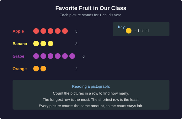
პიქტოგრაფი იყენებს პატარა სურათებს იმის საჩვენებლად, თუ რამდენია. ჩვენმა კლასმა ხმა მისცა საყვარელ ხილს, და თითოეული სურათი ერთი ბავშვის ხმას წარმოადგენს.
აქ არის ის, რასაც დიაგრამა ამბობს:
- ვაშლი: 5 სურათი, ამიტომ 5 ბავშვი.
- ბანანი: 3 სურათი, ამიტომ 3 ბავშვი.
- ყურძენი: 6 სურათი, ამიტომ 6 ბავშვი.
- ფორთოხალი: 2 სურათი, ამიტომ 2 ბავშვი.
პიქტოგრაფის წასაკითხად დაითვალეთ სურათები თითოეულ მწკრივში. ყველაზე გრძელი მწკრივი იგებს ყველაზე მეტ ხმას. ყველაზე მოკლე მწკრივი იგებს ყველაზე 적 ხმას.
რომელმა ხილმა გაიმარჯვა?
შენი ჯერია
დაუბრუნდი ხილის სქემას. ყურძენს აქვს 6 სურათი, ვაშლს — 5, ბანანს — 3, ხოლო ფორთოხალს — 2.
რიცხვები, რომლებსაც ხედავ
რატომ ვქმნით გრაფიკებს
გრაფიკი არის რიცხვების დანახვის საშუალება. იმის ნაცვლად, რომ წავიკითხოთ სია „5, 3, 6, 2“, შეგვიძლია ვნახოთ სურათების მწკრივები და ერთი მზერით გავიგოთ, რომელია ყველაზე დიდი.
როდესაც მწკრივი გრძელია ან ზოლი მაღალია, ეს ნიშნავს მეტს. როდესაც მწკრივი მოკლეა, ეს ნიშნავს ნაკლებს. შენი თვალები თვლის შენთვის. --- Ready for the next blocks.
წარმოიდგინეთ საკლასო ოთახში შინაური ცხოველების სვეტოვანი დიაგრამა:
- ძაღლები: მაღალი სვეტი.
- კატები: სვეტი ცოტა უფრო დაბალი, ვიდრე ძაღლების.
- თევზები: ძალიან დაბალი სვეტი.
რიცხვების გარეშეც კი შეგიძლიათ იხილოთ, რომ ძაღლებია ყველაზე მეტი, ხოლო თევზები — ყველაზე ცოტა, უბრალოდ სვეტების სიმაღლის შედარებით.
მაღალი ნიშნავს მეტს
შენი ჯერია
ჩვენს საყვარელ ცხოველთა სვეტოვან დიაგრამაში ძაღლის სვეტი მაღალია, კატის სვეტი ცოტა უფრო დაბალია, ხოლო თევზის სვეტი ძალიან დაბალია.
სამართლიანი რბენა
ერთნაირი დასაწყისი, ერთნაირი ზომა
იმისათვის, რომ დიაგრამა იყოს სამართლიანი, ორი რამ უნდა იყოს სიმართლე.
პირველი: ყველა სვეტი უნდა იწყებოდეს ერთნაირი ხაზიდან. წარმოიდგინეთ სარბენი ბილიკი. თუ ერთი მორბენალი ტრასის შუაში დაიწყებს, ეს არ იქნება სამართლიანი რბენა. სვეტები ყველა უნდა იწყებოდეს ერთნაირი ქვედა ხაზიდან, რათა მათი სიმაღლეები სამართლიანად შევადაროთ.
ორი: პიქტოგრაფზე ყველა სურათი უნდა აღნიშნავდეს ერთსა და იმავე რაოდენობას. თუ ერთი ვაშლის სურათი ნიშნავს 1 ბავშვს, მაგრამ ერთი ყურძნის სურათი ნიშნავს 5 ბავშვს, სურათების დათვლა შეგიყვანთ შეცდომაში. როდესაც ყველა სურათი ერთნაირ რაოდენობას აღნიშნავს, მწკრივები სამართლიანად ირჩევენ ერთმანეთს.
როდესაც ზოლები იწყება ერთი და იმავე ხაზიდან და ყველა სურათი ერთნაირად ითვლება, ყველაზე გრძელი მწკრივი მართლაც ყველაზე დიდ რაოდენობას აჩვენებს. ეს არის სამართლიანი დიაგრამა.
სამართლიანია თუ არა?
შენი ჯერია
მაია ქმნის პიქტოგრაფს. ვაშლის მწკრივში თითოეული ვაშლის სურათი ნიშნავს 1 ბავშვს. თუმცა ყურძნის მწკრივში ის ამბობს, რომ თითოეული ყურძნის სურათი ნიშნავს 5 ბავშვს.
ფრთხილად იყავი ხრიკებზე
როდესაც სურათი გაცრუებს
დიაგრამამ შეიძლება გაცრუოს თუ სურათები სხვადასხვა ზომისაა. ჩვენი თვალები აფასებს, თუ რამდენ ადგილს იკავებს სურათი, ამიტომ დიდი სურათი გვეჩვენება, რომ „მეტია“, თუნდაც ის მხოლოდ ერთ ხმას ნიშნავდეს.
წარმოიდგინეთ ხილის დიაგრამა, სადაც:
წარმოიდგინეთ ხილის დიაგრამა, სადაც:
- ვაშლის სურათი დახატულია უზარმაზარი, ბევრ ადგილს იკავებს, მაგრამ ის მხოლოდ 3 ხმას ნიშნავს.
- ყურძნის სურათი დახატულია პაწაწინა, მაგრამ ის 6 ხმას ნიშნავს.
თვალის ერთი შეხედვით, უზარმაზარი ვაშლი გამარჯვებულად მოგეჩვენებათ. მაგრამ თუ რეალურ ხმებს დათვლით, ყურძენს მეტი აქვს! დიდმა სურათმა თვალი გაგიბრუათ.
გაკვეთილი: ნუ უყურებ მხოლოდ იმას, თუ რამდენად დიდია სურათი. შეამოწმე რეალური რიცხვები და დარწმუნდი, რომ ყველა სურათი ერთნაირი ზომისაა და ერთნაირ რაოდენობას წარმოადგენს.
იპოვე ხრიკი
შენი ჯერია
გრაფიკი ხატავს გიგანტურ ვაშლის სურათს, რომელიც ნიშნავს 3 ხმას, და პატარა ყურძნის სურათს, რომელიც ნიშნავს 6 ხმას. ვაშლი უფრო დიდი ჩანს, ამიტომ ჩანს, რომ ვაშლმა გაიმარჯვა.