Cijfers die liegen terwijl ze de waarheid vertellen
Bewijs en statistiek lezen
Een statistiek kan volledig nauwkeurig zijn en je toch nog misleiden. Elk cijfer in een kop, een studie, een dashboard of een geautomatiseerd rapport heeft een reeks keuzes doorstaan voordat het bij je aankwam. Iemand koos een maat, een steekproef, een bereik en een as.
De vaardigheid die je vandaag ontwikkelt, leest al deze vier elementen: de maat (welk gemiddelde), de spreiding (hoezeer de data varieert), de steekproef (wie werd geteld) en de as (hoe de grafiek het weergeeft).
Wanneer deze keuzes onbevraagd blijven, vertellen correcte cijfers een vals verhaal. Wanneer je ze in twijfel trekt, zie je wat de data eigenlijk zegt.
Een getal dat je half geloofde
Voordat we beginnen, denk na over een statistiek die je bent tegengekomen.
Drie gemiddelden, drie verhalen
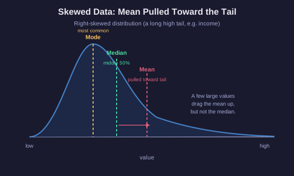
Het woord "gemiddelde" verbergt een keuze
Drie verschillende maten worden allemaal het gemiddelde genoemd. Ze komen meestal niet overeen, en het verschil ertussen is informatie.
- Gemiddelde (mean): tel alle waarden op, deel door het aantal. Gevoelig voor elk getal, dus één uitschieter trekt het mee.
- Mediaan: sorteer de waarden, neem de middelste. De helft van de data zit erboven, de helft eronder. Een uitschieter verplaatst het nauwelijks.
- Modus: de waarde die het vaakst voorkomt. Nuttig voor categorieën en voor het vinden van het typische geval in een oneffen verdeling.
Wanneer elk van hen misleidt
Overweeg zeven huishoudens met inkomens, in duizenden: 30, 32, 35, 38, 40, 42 en één op 250.
Het gemiddelde is ongeveer 67k, maar zes van de zeven huishoudens verdienen minder dan dat. De enkele waarde van 250k trok het gemiddelde omhoog tot boven bijna iedereen. De mediaan is 38k, het echte midden, en beschrijft een typisch huishouden veel beter.
Dit is de klassieke inkomensval. Rapporteer je het gemiddelde, dan lijkt een scheve groep rijker dan ze in werkelijkheid is. Rapporteer je de mediaan, dan zie je het midden.
De regel: bij scheve data of data met uitliggers vertelt de mediaan het eerlijke verhaal. Bij ongeveer symmetrische data zonder uitersten komen het gemiddelde en de mediaan bijna overeen en werkt er beide.
Kies de eerlijke maat
Aan jou de beurt
Een stad meldt dat de "gemiddelde" huisprijs 900k is. Je ontdekt dat de meeste huizen werden verkocht voor tussen de 250k en 400k, maar dat drie villa's elk voor meer dan 6 miljoen werden verkocht.
Bereken het zelf
Een kleine dataset
Zeven werknemers bij een startup verdienen deze jaarlijkse salarissen, in duizenden:
40, 42, 45, 48, 50, 55 en de oprichter op 400.
Bepaal beide maten van centraliteit en beslis daarna welke waarde een werkzoekende moet vertrouwen wanneer hij of zij een typisch salaris hier voor zich omtrekt.
Zelfde gemiddelde, verschillende werelden
Een gemiddelde verbergt de spreiding
Twee datasets kunnen een identiek gemiddelde delen en toch volledig verschillende realiteiten beschrijven. Het gemiddelde zegt niets over hoe ver de waarden verspreid liggen.
Testscores van klas A: 78, 80, 82, 80, 80. Gemiddelde 80, iedereen dicht op elkaar.
Testscores van klas B: 40, 100, 60, 100, 100. Gemiddelde 80, maar de scores schommelen wild van onvoldoende tot perfect.
Zelfde gemiddelde van 80. De ene klas is uniform, de andere is verdeeld in zwakke leerlingen en sterren. Een rapport dat zegt dat beide klassen "gemiddeld 80 haalden", wist dat verschil uit.
De spreiding, gemeten door bereik of standaardafwijking, laat zien hoe sterk de waarden om het centrum heen variëren. Gemiddelden zonder spreiding zijn een halve zin. Vraag altijd hoe breed de data verspreid ligt.
De steekproef is het argument
Kleine steekproeven zijn ruisachtig; vertekende steekproeven zijn fout
Een statistiek beschrijft degene die gemeten is. Als de steekproef klein of niet-representatief is, zegt het getal weinig over de bredere wereld, hoe precies het er ook uitziet.
- Steekproefgrootte: kleine steekproeven schommelen wild door toeval. Gooi een eerlijke munt 4 keer en 100% kop is gangbaar; gooi hem 4.000 keer en het stabiliseert rond de 50%. Een "verbetering van 40%" afkomstig van 10 personen is grotendeels ruis.
- Representativiteit: een peiling van één wijk, één leeftijdsgroep of de gebruikers van één website kan niet voor iedereen spreken. De steekproef moet de populatie weerspiegelen die je wilt beschrijven.
- Selectiebias: hoe je de steekproef verzamelt, vertekent deze. Een online enquête bereikt alleen mensen die deze zagen en ervoor kozen om te antwoorden.
- Survivorship bias: je meet alleen de overlevenden. In de Tweede Wereldoorlog studeerden ingenieurs de terugkerende vliegtuigen om te bepalen waar ze pantsering moesten toevoegen en markeerden ze de kogelgaten. Abraham Wald wees erop dat de pantsering hoort waar de terugkerende vliegtuigen GEEN gaten hadden, omdat vliegtuigen die daar geraakt werden, nooit terugkwamen om geteld te worden.
De ontbrekende data, de mensen of gevallen die uitvielen, is vaak belangrijker dan de data die je in handen hebt.
Een grafiek is een betoog met inkt
Vier manieren waarop een eerlijk getal een oneerlijke grafiek krijgt
Correcte data kunnen zo worden getekend dat ze misleiden. Leer de vier meest voorkomende visuele trucjes.
- Afgekapt as: een verticale as die begint boven nul in plaats van op nul. Een verandering van 50 naar 52 vult het hele diagram en lijkt enorm, hoewel het slechts een verandering van 4% is.
- Dubbele assen: twee lijnen op twee verschillende verticale schalen, afgestemd tot ze lijken te volgen. De correlatie wordt gefabriceerd door de keuze van schalen, en is niet in de data te vinden.
- Gekrompte periode: het kiezen van alleen het tijdsvenster dat de bewering ondersteunt. Begin een temperatuur- of prijsgrafiek bij een handig piek- of dalpunt en de trend keert om.
- Oppervlakte- versus lengtevervorming: het schalen van de breedte EN de hoogte van een icoon om een verdubbelde waarde weer te geven, maakt het OPPERVLAK vier keer zo groot. Het oog leest oppervlakte, dus een 2x figuur lijkt 4x.
Elk van deze trucjes gebruikt accurate cijfers. De misleiding zit in de tekening, niet in de data.
De derde variabele
Twee dingen bewegen samen. En dan?
Wanneer twee metingen samen stijgen en dalen, zijn ze gecorreleerd. Correlatie is reëel en nuttig, maar het bewijst niet dat de ene de andere OORZAAKT. Drie onschuldige verklaringen concurreren altijd met causaliteit:
- Omgekeerde causaliteit: B zou A kunnen veroorzaken, in plaats van dat A B veroorzaakt.
- Toeval: met genoeg variabelen zullen er enkele puur toevallig samenhangen.
- Een verstorende factor (confounder): een verborgen derde variabele drijft beide.
Klassiek voorbeeld: ijsverkoop correleert met verdrinkingsdoden. Ijs verdrinkt niemand. De verstorende factor is zomershete, wat zowel de ijsverkoop als het aantal zwemmers verhoogt.
Voordat je een causale claim gelooft, zoek naar de verstorende factor. Vraag je af welke derde factor beide cijfers tegelijk zou kunnen beïnvloeden.
De checklist van de scepticus
Nog één laatste gedachte
Je hebt nu een checklist voor elke statistiek die je pad kruist:
1. Maatstaf: om welke gemiddelde gaat het, en maakt scheefheid of een uitschieter het onbetrouwbaar?
2. Verspreiding: verbergt het gemiddelde grote variatie?
3. Steekproef: wie is meegeteld, hoeveel, en wie ontbreekt?
4. Grafiek: waar begint de as, en is het bereik selectief gekozen?
5. Stelling: wordt deze correlatie verkocht als causaliteit, en welke verstorende factor zou het kunnen verklaren?
Accurate cijfers kunnen toch misleiden. Het getal is nooit het hele argument. De keuzes erachter wel.