Numbers That Lie While Telling the Truth
Reading Evidence and Statistics
A statistic can be completely accurate and still deceive you. Every number in a headline, a study, a dashboard, or an automated report survived a set of choices before it reached you. Someone picked a measure, a sample, a range, and an axis.
The skill you build today reads all four: the measure (which average), the spread (how much the data varies), the sample (who got counted), and the axis (how the chart draws it).
When those choices go unquestioned, correct numbers tell a false story. When you question them, you see what the data actually says.
A Number You Half-Believed
Before we start, think about a statistic you have encountered.
Three Averages, Three Stories
The word "average" hides a choice
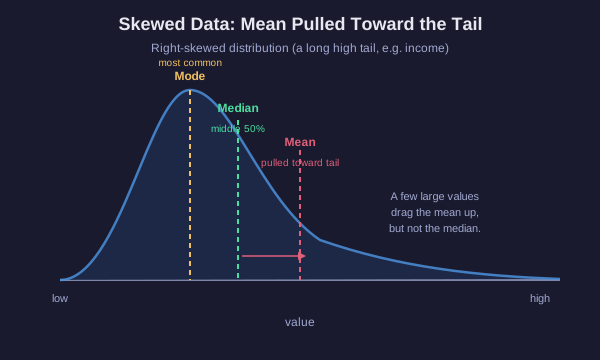
Three different measures all get called the average. They usually disagree, and the gap between them is information.
- Mean: add every value, divide by the count. Sensitive to every number, so a single extreme value drags it.
- Median: sort the values, take the middle one. Half the data sits above, half below. An outlier barely moves it.
- Mode: the value that appears most often. Useful for categories and for finding the typical case in a lumpy distribution.
When each one misleads
Consider seven households with incomes, in thousands: 30, 32, 35, 38, 40, 42, and one at 250.
The mean is about 67k, but six of seven households earn less than that. The lone 250k value pulled the mean above almost everyone. The median is 38k, the true middle, and it describes a typical household far better.
This is the classic income trap. Report the mean and a skewed group looks richer than it is. Report the median and you see the middle.
The rule: on skewed data or data with outliers, the median tells the honest story. On roughly symmetric data with no extremes, the mean and median nearly agree and either works.
Choose the Honest Measure
Your turn
A town reports that its "average" home price is 900k. You learn that most homes sold for between 250k and 400k, but three mansions sold for over 6 million each.
Compute It Yourself
A small dataset
Seven employees at a startup earn these yearly salaries, in thousands:
40, 42, 45, 48, 50, 55, and the founder at 400.
Work out both measures of center, then decide which one a job seeker should trust when picturing a typical salary here.
Same Average, Different Worlds
An average hides the spread
Two datasets can share an identical mean and describe completely different realities. The average says nothing about how far the values scatter.
Class A test scores: 78, 80, 82, 80, 80. Mean 80, everyone clustered tight.
Class B test scores: 40, 100, 60, 100, 100. Mean 80, but scores swing wildly from failing to perfect.
Same mean of 80. One class is uniform, the other is split into strugglers and stars. A report that says both classes "averaged 80" erases that difference.
The spread, measured by range or standard deviation, tells you how much the values vary around the center. Averages without spread are half a sentence. Always ask how wide the data scatters.
The Sample Is the Argument
Small samples are noisy; biased samples are wrong
A statistic describes whoever got measured. If the sample is small or unrepresentative, the number says little about the wider world, no matter how precise it looks.
- Sample size: small samples swing wildly by chance. Flip a fair coin 4 times and 100% heads is common; flip it 4,000 times and it settles near 50%. A "40% improvement" from 10 people is mostly noise.
- Representativeness: a poll of one neighborhood, one age group, or one website's users cannot speak for everyone. The sample must mirror the population you want to describe.
- Selection bias: how you gather the sample tilts it. An online survey only reaches people who saw it and chose to answer.
- Survivorship bias: you only measure the survivors. In World War II, engineers studied returning planes to decide where to add armor and marked the bullet holes. Abraham Wald pointed out the armor belonged where the returning planes had NO holes, because planes hit there never came back to be counted.
The missing data, the people or cases that dropped out, often matters more than the data you hold.
A Chart Is an Argument With Ink
Four ways an honest number gets a dishonest chart
Correct data can be drawn to mislead. Learn the four most common visual tricks.
- Truncated axis: a vertical axis that starts above zero instead of at zero. A change from 50 to 52 fills the whole chart and looks enormous, though it is a 4% move.
- Dual axes: two lines on two different vertical scales, tuned until they appear to track each other. The correlation is manufactured by the choice of scales, not found in the data.
- Cherry-picked range: choosing only the window of time that supports the claim. Start a temperature or price chart at a convenient peak or trough and the trend flips.
- Area-vs-length distortion: scaling an icon's width AND height to show a doubled value makes its AREA four times larger. The eye reads area, so a 2x figure looks like 4x.
Every one of these uses accurate numbers. The deception lives in the drawing, not the data.
The Third Variable
Two things move together. So what?
When two measurements rise and fall together, they are correlated. Correlation is real and useful, but it does not prove one CAUSES the other. Three innocent explanations always compete with causation:
- Reverse causation: B might cause A, not A causes B.
- Coincidence: with enough variables, some will track by pure chance.
- A confounder: a hidden third variable drives both.
Classic example: ice cream sales correlate with drowning deaths. Ice cream does not drown anyone. The confounder is summer heat, which raises both ice cream sales and the number of people swimming.
Before believing a causal claim, hunt for the confounder. Ask what third thing could be moving both numbers at once.
The Skeptic's Checklist
One last thought
You now have a checklist for any statistic that crosses your path:
1. Measure: which average is this, and does skew or an outlier make it lie?
2. Spread: does the average hide wild variation?
3. Sample: who got counted, how many, and who is missing?
4. Chart: where does the axis start, and is the range cherry-picked?
5. Claim: is this correlation being sold as causation, and what confounder might explain it?
Accurate numbers can still mislead. The number is never the whole argument. The choices behind it are.