Bienvenue
Lire les données sans se laisser berner
Les chiffres semblent honnêtes. Un graphique semble être une preuve. Mais un graphique peut être techniquement vrai tout en trompant votre œil.
Les tableaux de bord au travail, les graphiques dans les actualités et les rapports automatisés affichent tous de vrais chiffres. Le problème se cache dans la manière dont ces chiffres sont représentés : le point de départ d'un axe, les dates affichées et qui a été compté.
Aujourd'hui, vous apprendrez quatre techniques de détective : lire la dispersion derrière une moyenne, repérer un graphique trompeur, remettre en question l'échantillon et exiger une comparaison équitable.
Une moyenne n'est pas toute l'histoire
La moyenne masque l'écart
Une moyenne (la moyenne arithmétique) additionne toutes les valeurs et divise par leur nombre. Elle donne un nombre unique et ordonné. Cette ordonnance est le danger : un seul nombre ne peut pas montrer à quel point les données sont dispersées.
L'étendue est la distance entre la valeur la plus petite et la plus grande. L'écart est la mesure dans laquelle les valeurs sont généralement dispersées.
Deux piscines, profondeur moyenne de 1 mètre chacune.
- Piscine A : chaque partie est profonde de 1 mètre. On peut y wader (se promener à pied).
- Piscine B : la partie peu profonde fait 0,1 mètre et la partie profonde 3 mètres. La moyenne est toujours d'environ 1 mètre, mais un jeune enfant pourrait se noyer dans la partie profonde.
Même moyenne. Réalité complètement différente. La moyenne a masqué l'écart. Chaque fois que vous voyez une moyenne, demandez-vous : quelle est l'étendue, et dans quelle mesure les valeurs sont-elles dispersées ?
Le problème de la piscine
À vous de jouer
Un rapport indique : La profondeur moyenne de cette piscine est de 1 mètre, elle est donc sûre pour les tout-petits.
Trois façons dont un graphique ment
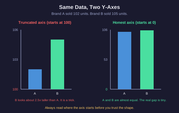
Un graphique peut être vrai et mentir tout de même
Un graphique peut afficher des chiffres corrects et vous tromper quand même. Voici trois des astuces les plus courantes :
1. Axe y tronqué (zoomé). Un diagramme à barres honnête commence son axe y à zéro. Un graphique trompeur commence à mi-hauteur, par exemple à 100. Regardez l'image : la marque A a vendu 102 et la marque B a vendu 105, une différence de seulement 3 unités. Lorsque l'axe commence à 100, la barre de la marque B semble environ 2,5 fois plus haute. Si l'axe commence à 0, les barres sont presque égales. Les données n'ont jamais changé. Seul le point de départ a changé.
2. Période temporelle choisie à l'envi. N'afficher que la tranche de dates qui soutient votre récit. Un titre en baisse tout au long de l'année paraît excellent si l'on ne représente que le seul mois positif. Demandez-vous : pourquoi le graphique commence-t-il et se termine-t-il à ces dates exactes ?
3. Échelle modifiée ou incohérente. Un espacement inégal entre les nombres, ou une échelle qui change en cours de route, peut étirer ou écraser les variations. Une ligne peut paraître comme une falaise ou une colline douce en utilisant les mêmes chiffres.
La démarche du détective est toujours la même : lire l'axe et l'intervalle avant de faire confiance à la forme.
Pourquoi ce graphique est-il trompeur ?
Repérer l'astuce
Un graphique d'actualité montre deux barres : le nombre de crimes le mois dernier était de 500, celui de ce mois est de 515. Mais l'axe des y commence à 495 au lieu de 0. À l'écran, la barre de ce mois paraît environ quatre fois plus haute que celle du mois dernier. Le titre annonce : Les crimes explosent !
Demander à quelques-uns plutôt qu'à tout le monde
L'échantillon : quelques-uns qui représentent l'ensemble
Souvent, vous ne pouvez pas interroger tout le monde, alors vous interrogez un échantillon : un groupe plus petit censé représenter l'ensemble du groupe (la population).
Un échantillon ne dit la vérité sur l'ensemble que s'il le représente. S'il ne le fait pas, c'est un échantillon biaisé.
Exemples d'échantillons biaisés :
- Un site web demande à ses propres visiteurs s'ils aiment le site. Les gens qui le détestent sont déjà partis.
- Une enquête sur la cantine scolaire est distribuée uniquement aux élèves qui quittent la file de la pizza.
- Un sondage est réalisé uniquement un après-midi de semaine, excluant ainsi toutes les personnes qui travaillent.
Deux questions révèlent la plupart des biais : Qui a été laissé de côté ? et Les personnes exclues répondraient-elles différemment ? Un grand échantillon ne corrige pas le biais ; un sondage d'un million de mauvaises personnes reste faux.
Le problème du sondage
À vous de jouer
Une salle de sport affiche : Nous avons interrogé 200 personnes dans notre salle de sport un samedi matin. 95 % d'entre elles disent que l'exercice est facile à intégrer dans une semaine chargée. Donc, l'exercice est facile pour presque tout le monde.
Mêmes unités, même référence
Ce qui rend une comparaison équitable
Le dernier outil du détective est le plus simple : lorsque deux éléments sont comparés, vérifiez que la comparaison est équitable.
Une comparaison équitable utilise les mêmes unités et la même référence pour les deux côtés.
Les comparaisons inéquitables se cachent en plein jour :
- Unités différentes. Notre téléphone a 5000 de batterie, le leur n'en a que 12 ! Un nombre est en milliampères-heure, l'autre en heures. On ne peut pas les comparer.
- Base de référence différente. La ville A a eu 50 crimes, la ville B en a eu 200, donc la ville B est beaucoup plus dangereuse. Mais la ville B a 20 fois plus d'habitants. Par habitant, la ville A est pire. Comparez les taux (pour 1000 habitants), pas les totaux bruts.
- Durées différentes. Mettre en balance une année entière d'une chose contre un mois d'une autre n'est pas une course équitable.
Avant d'accepter une comparaison, demandez-vous : mêmes unités ? même base de référence ? même durée ?
Le problème de la ville
À vous de jouer
Un article affirme : La ville A a signalé 50 vols l'année dernière. La ville B a signalé 200 vols l'année dernière. La ville B est quatre fois plus dangereuse. La ville A compte 10 000 habitants. La ville B compte 500 000 habitants.
Que retiendrez-vous ?
Une dernière réflexion
Les chiffres et les graphiques ne sont pas des mensonges par nature. Ce sont des outils, et comme tout outil, ils peuvent être utilisés à bon escient ou de manière trompeuse. Un tableau de bord, un graphique d'actualité et un rapport automatisé peuvent chacun être techniquement vrais tout en vous donnant une fausse image de la réalité.
Vous disposez désormais de quatre méthodes d'investigation : lire la dispersion derrière une moyenne, vérifier où l'axe d'un graphique commence et quel intervalle il affiche, se demander qui est inclus dans l'échantillon, et exiger les mêmes unités et la même base de référence pour toute comparaison.
Lisez l'axe et l'échantillon, pas seulement la forme.